Introduction
The layout system in Sheaf UI provides a flexible foundation for building application interfaces. These components work together seamlessly to create responsive, accessible layouts with minimal configuration.
The system includes four core components:
- Layout - The container that orchestrates layout behavior
- Sidebar - Collapsable navigation with responsive behavior
- Navlist - Structured navigation items and groups
- Header - Top bar for branding and actions
- Navbar - Structured navigation items for header
Installation
Use the Sheaf artisan command to install all layout components:
php artisan sheaf:install layout sidebar navlist navbar
Layout Variants
Sheaf UI offers two primary layout variants, each optimized for different use cases.
if you need more variants ask us with details
Sidebar-Main Layout
The classic dashboard pattern with a prominent sidebar containing primary navigation. The sidebar spans the full height and can collapse to icon-only mode.
Usage
<x-ui.layout>
    <x-ui.sidebar>
        <x-slot:brand>
            <x-ui.brand name="Your App" href="/" />
        </x-slot:brand>

        <x-ui.navlist>
            <x-ui.navlist.item label="Dashboard" icon="home" href="/" />
            <x-ui.navlist.item label="Settings" icon="cog-6-tooth" href="/settings" />
        </x-ui.navlist>
    </x-ui.sidebar>

    <x-ui.layout.main>
        <x-ui.layout.header>
            <x-ui.navbar>
                <x-ui.navbar.item label="Home" icon="home" />
            </x-ui.navbar>

            <!-- User menu, search, etc. -->
        </x-ui.layout.header>

        <!-- Your page content -->
        <div class="p-6">
            {{ $slot }}
        </div>
    </x-ui.layout.main>
</x-ui.layout>
Visual Example
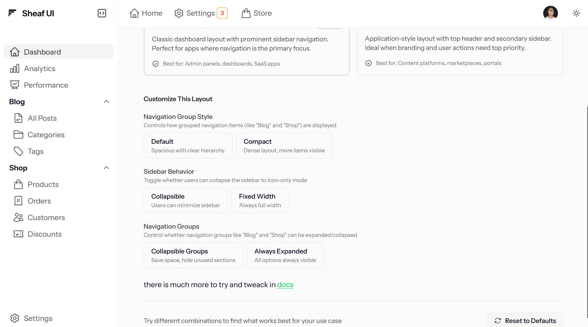
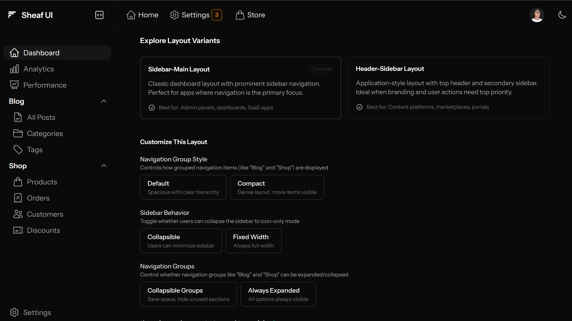
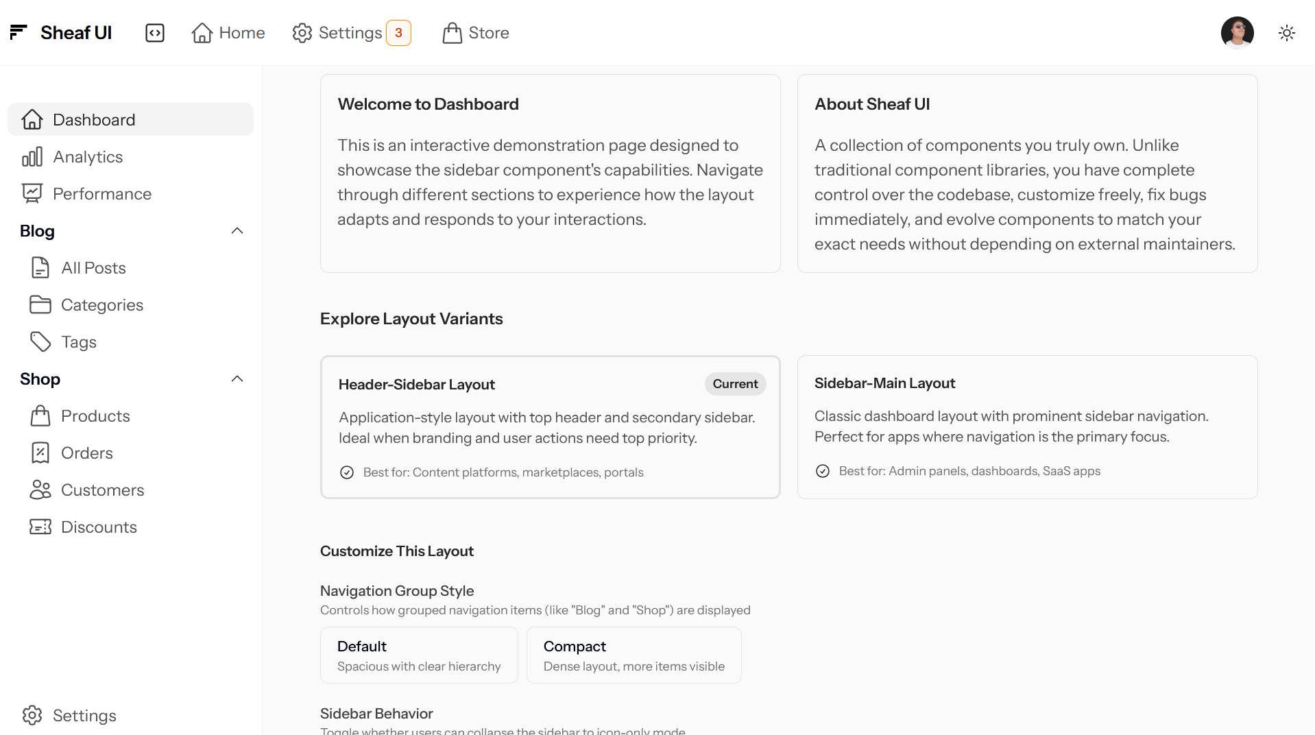
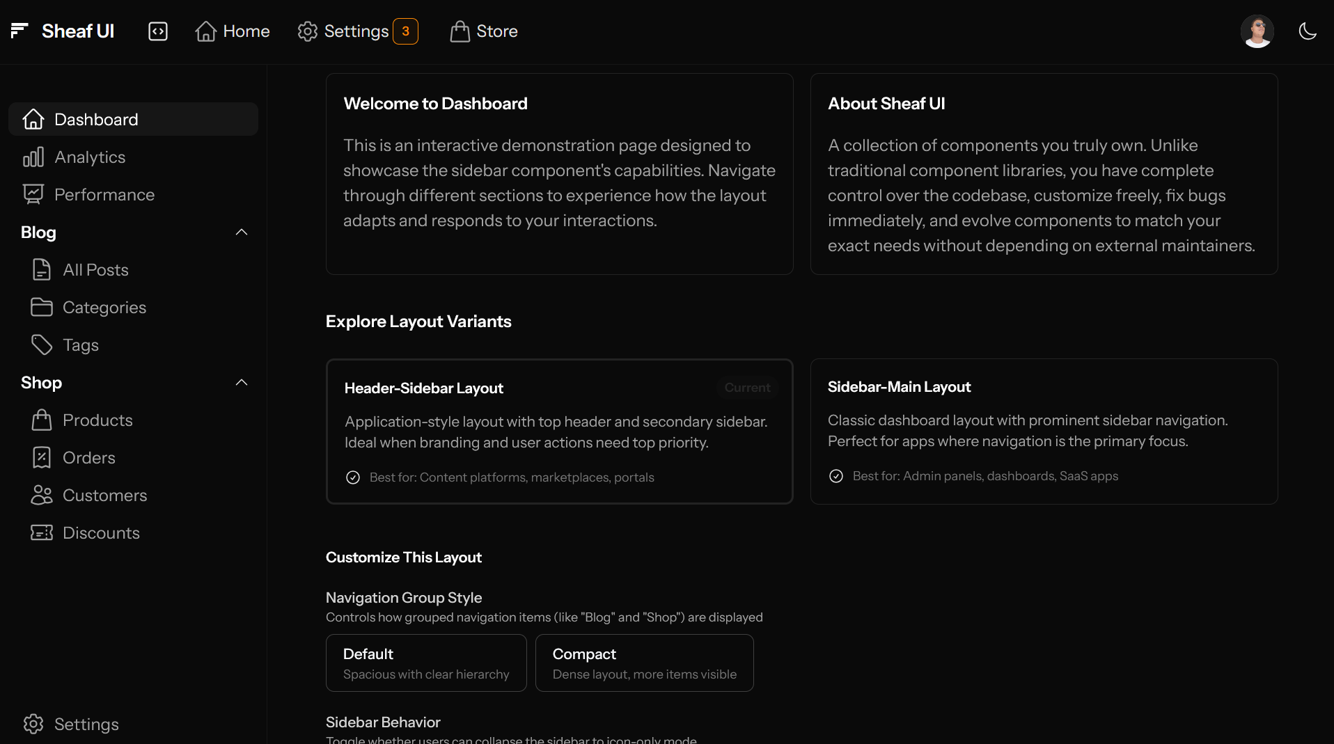
Header-Sidebar Layout
An application-style layout with a top header containing branding and primary actions, with a secondary sidebar for navigation. The header spans the full width above both the sidebar and main content.
Usage
<x-ui.layout variant="header-sidebar">
    <x-ui.layout.header>
        <x-slot:brand>
            <x-ui.brand name="Your App" href="/" />
        </x-slot:brand>

        <x-ui.navbar class="flex-1">
            <x-ui.navbar.item label="Home" icon="home" />
            <x-ui.navbar.item label="Products" icon="shopping-bag" />
        </x-ui.navbar>

        <!-- User menu, notifications, etc. -->
        <div class="ml-auto flex items-center gap-4">
            <x-ui.avatar src="/user.png" />
        </div>
    </x-ui.layout.header>

    <x-ui.sidebar>
        <x-ui.navlist>
            <x-ui.navlist.item label="Dashboard" icon="home" href="/" />
            <x-ui.navlist.group label="Content">
                <x-ui.navlist.item label="Posts" icon="document" />
                <x-ui.navlist.item label="Pages" icon="folder" />
            </x-ui.navlist.group>
        </x-ui.navlist>
    </x-ui.sidebar>

    <x-ui.layout.main>
        <!-- Your page content -->
        <div class="p-6">
            {{ $slot }}
        </div>
    </x-ui.layout.main>
</x-ui.layout>
Visual Example
Core Components Overview
Layout Component
The root <x-ui.layout> component orchestrates the entire layout system. It handles:
- Responsive breakpoint detection
- Sidebar collapse state management
- Mobile overlay behavior
- CSS custom properties for sizing
- Alpine.js state coordination
Sidebar
Provides collapsable navigation with responsive behavior across all screen sizes. Adapts automatically based on parent layout variant.
Key features:
- Mobile overlay with backdrop
- Icon-only collapsed state on desktop
- Persistent state via localStorage
- Touch-optimized interactions
- Scrollable content area
Header
Top bar component for branding, navigation, and user actions. Behavior changes based on layout variant.
In sidebar-main: Optional secondary navigation bar
In header-sidebar: Primary header spanning full width
Navlist
Structures navigation items and groups within the sidebar. Handles active states, nesting, and collapse behavior.
Features:
- Individual navigation items
- Collapsable groups
- Active state indicators
- Tooltip support when sidebar collapsed
- Flexible variants (default, compact)
Navbar
Horizontal navigation component for the header. Provides top-level or contextual navigation.
Common Patterns
Full Application Layout
Complete layout with all components working together:
<x-ui.layout>
    <x-ui.sidebar :collapsable="true">
        <x-slot:brand>
            <x-ui.brand name="My App" href="/" />
        </x-slot:brand>

        <x-ui.navlist>
            <x-ui.navlist.item label="Dashboard" icon="home" href="/" />

            <x-ui.navlist.group label="Content" :collapsable="true">
                <x-ui.navlist.item label="Posts" icon="document-text" href="/posts" />
                <x-ui.navlist.item label="Pages" icon="folder" href="/pages" />
            </x-ui.navlist.group>

            <x-ui.navlist.group label="Shop">
                <x-ui.navlist.item label="Products" icon="shopping-bag" href="/products" />
                <x-ui.navlist.item label="Orders" icon="receipt-percent" href="/orders" />
            </x-ui.navlist.group>
        </x-ui.navlist>

        <x-ui.sidebar.push />

        <x-ui.navlist>
            <x-ui.navlist.item label="Settings" icon="cog-6-tooth" href="/settings" />
        </x-ui.navlist>
    </x-ui.sidebar>

    <x-ui.layout.main>
        <x-ui.layout.header>
            <x-ui.sidebar.toggle class="md:hidden" />

            <x-ui.navbar class="flex-1 hidden lg:flex">
                <x-ui.navbar.item label="Home" icon="home" />
                <x-ui.navbar.item label="Discover" icon="magnifying-glass" />
            </x-ui.navbar>

            <div class="ml-auto flex items-center gap-4">
                <x-ui.theme-switcher />
                <x-ui.avatar src="/user.png" />
            </div>
        </x-ui.layout.header>

        <div class="p-6">
            {{ $slot }}
        </div>
    </x-ui.layout.main>
</x-ui.layout>
Bottom-Aligned Navigation Items
Use <x-ui.sidebar.push /> to push subsequent items to the bottom of the sidebar:
<x-ui.navlist>
    <!-- Top navigation -->
    <x-ui.navlist.item label="Dashboard" icon="home" />
    <x-ui.navlist.item label="Analytics" icon="chart-bar" />
</x-ui.navlist>

<!-- Spacer pushes everything below to bottom -->
<x-ui.sidebar.push />

    <!-- Bottom navigation -->
<x-ui.navlist>
    <x-ui.navlist.item label="Settings" icon="cog-6-tooth" />
    <x-ui.navlist.item label="Logout" icon="arrow-right-on-rectangle" />
</x-ui.navlist>
Grouped Navigation with Variants
Control how navigation groups appear using the variant prop:
<!-- Default: Spacious groups with clear hierarchy -->
<x-ui.navlist.group label="Content" variant="default">
    <x-ui.navlist.item label="Posts" icon="document-text" />
    <x-ui.navlist.item label="Pages" icon="folder" />
</x-ui.navlist.group>

<!-- Compact: Dense layout showing more items -->
<x-ui.navlist.group label="Shop" variant="compact">
    <x-ui.navlist.item label="Products" icon="shopping-bag" />
    <x-ui.navlist.item label="Orders" icon="receipt-percent" />
    <x-ui.navlist.item label="Customers" icon="users" />
</x-ui.navlist.group>
Responsive Behavior
The layout system automatically adapts across breakpoints:
Mobile (< 768px)
- Sidebar becomes overlay with backdrop
- Toggle button visible in header
- Tap outside to close sidebar
- Full-width main content
Tablet (768px - 1024px)
- Sidebar always in collapsed (icon-only) mode
- Visible alongside main content
- Tap sidebar to toggle on touch devices
Desktop (>= 1024px)
- Full collapsable/expandable sidebar
- State persists in localStorage
- Smooth width transitions
- Keyboard shortcuts supported
- Hover shows tooltips
Design Principles
Composition Over Configuration
Small, focused components that compose together rather than monolithic components with dozens of props.
Contextual Awareness
Child components automatically adapt based on parent state (e.g., navlist items show tooltips when sidebar is collapsed).
Progressive Enhancement
Works without JavaScript for basic functionality, enhanced with Alpine.js for interactive features.
Accessibility First
Built-in ARIA attributes, keyboard navigation, and screen reader support throughout.