Introduction
The Layout component is the foundation of Sheaf UI's layout system. It orchestrates the entire application structure by managing viewport detection, sidebar collapse state, and coordinating child components (Sidebar, Header, Main) across different screen sizes.
Think of it as the conductor of an orchestra, it doesn't make much noise itself, but it ensures every component works together harmoniously.
Installation
php artisan sheaf:install layout
Basic Usage
The Layout component wraps your entire main application contents (not the master layout):
<head>
<!-- vite.. -->
</head>
<body>
<x-ui.layout>
    <x-ui.sidebar>
        <!-- Sidebar content -->
    </x-ui.sidebar>

    <x-ui.layout.main>
        <x-ui.layout.header>
            <!-- Header content -->
        </x-ui.layout.header>

        <!-- Page content -->
        <div class="p-6">
            {{ $slot }}
        </div>
    </x-ui.layout.main>
</x-ui.layout>
</body>
this is layout isn't the master layout, to use it you need to wrap it with a base layout like
<x-layouts.base>...<x-layouts.base> who has the javascript and css imports
Variants
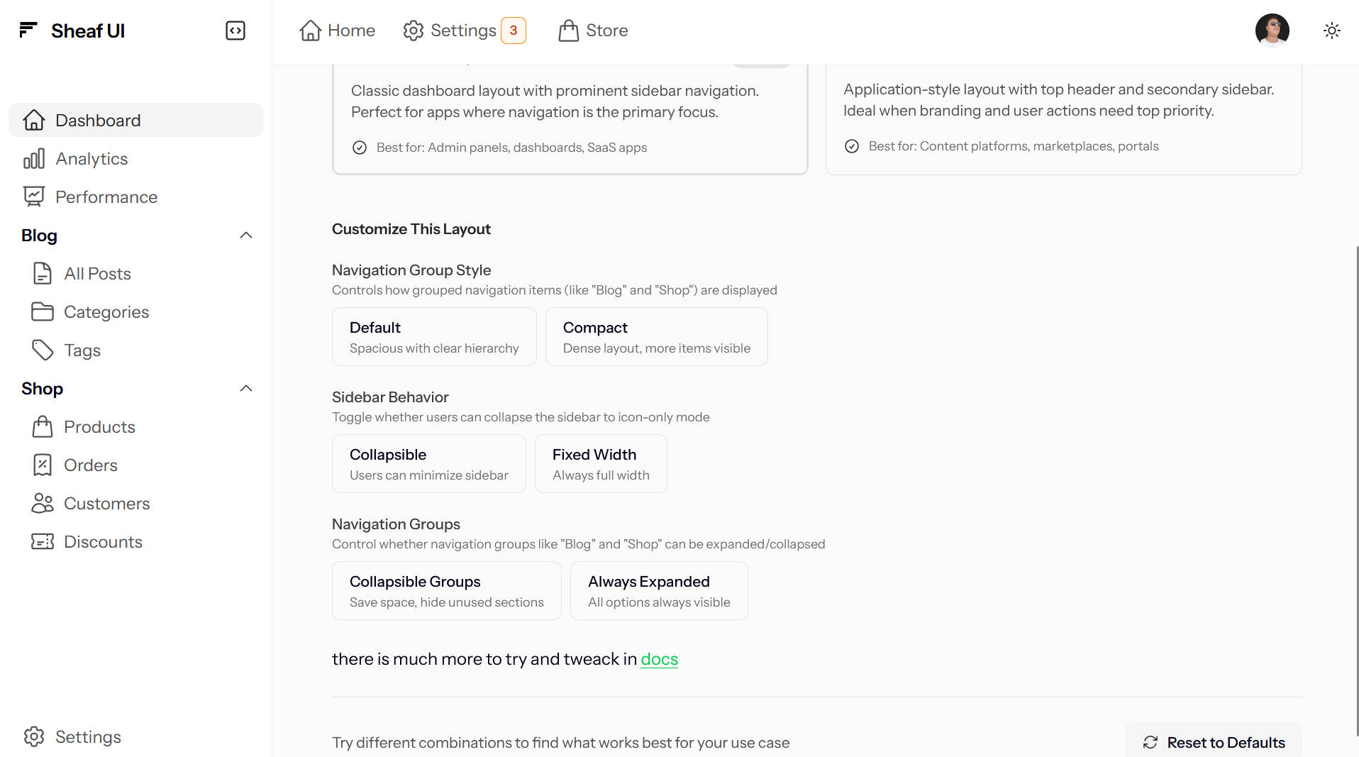
Sidebar-Main Layout
The classic dashboard pattern with a prominent sidebar containing primary navigation. The sidebar spans the full height and can collapse to icon-only mode.
Usage
<x-ui.layout>
    <x-ui.sidebar>
        <x-slot:brand>
            <x-ui.brand name="Your App" href="/" />
        </x-slot:brand>

        <x-ui.navlist>
            <x-ui.navlist.item label="Dashboard" icon="home" href="/" />
            <x-ui.navlist.item label="Settings" icon="cog-6-tooth" href="/settings" />
        </x-ui.navlist>
    </x-ui.sidebar>

    <x-ui.layout.main>
        <x-ui.layout.header>
            <x-ui.navbar>
                <x-ui.navbar.item label="Home" icon="home" />
            </x-ui.navbar>

            <!-- User menu, search, etc. -->
        </x-ui.layout.header>

        <!-- Your page content -->
        <div class="p-6">
            {{ $slot }}
        </div>
    </x-ui.layout.main>
</x-ui.layout>
Visual Example
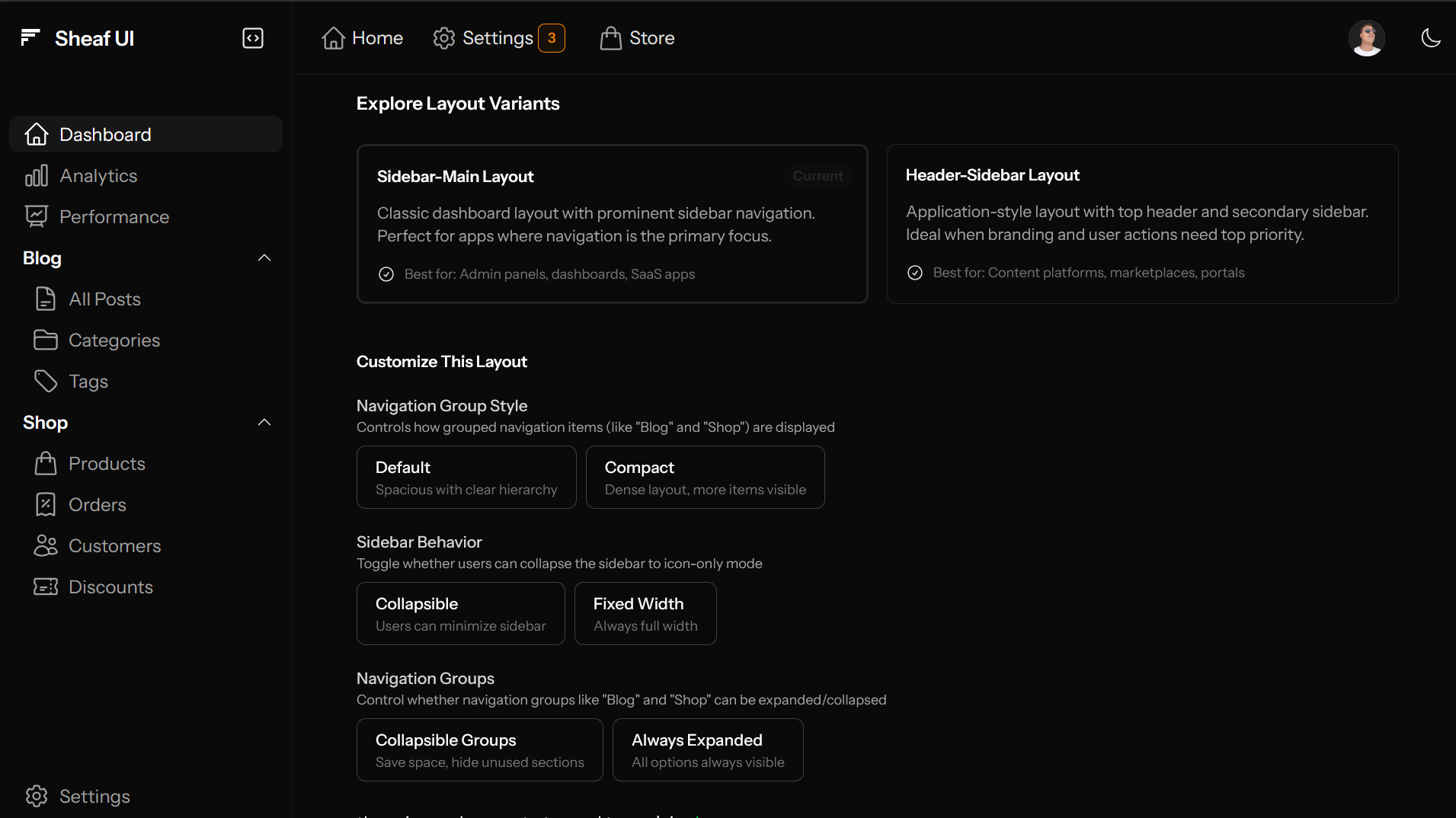
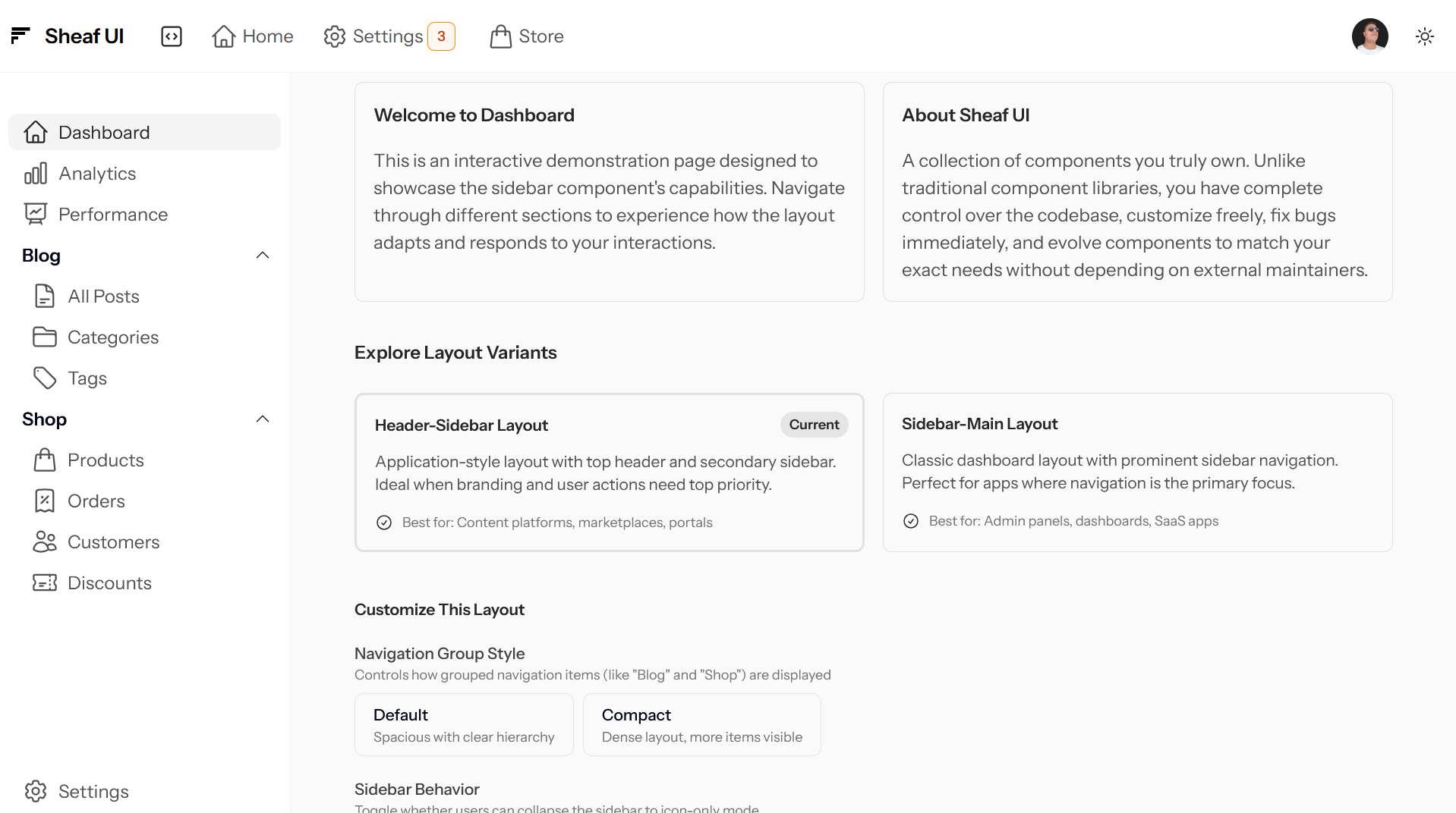
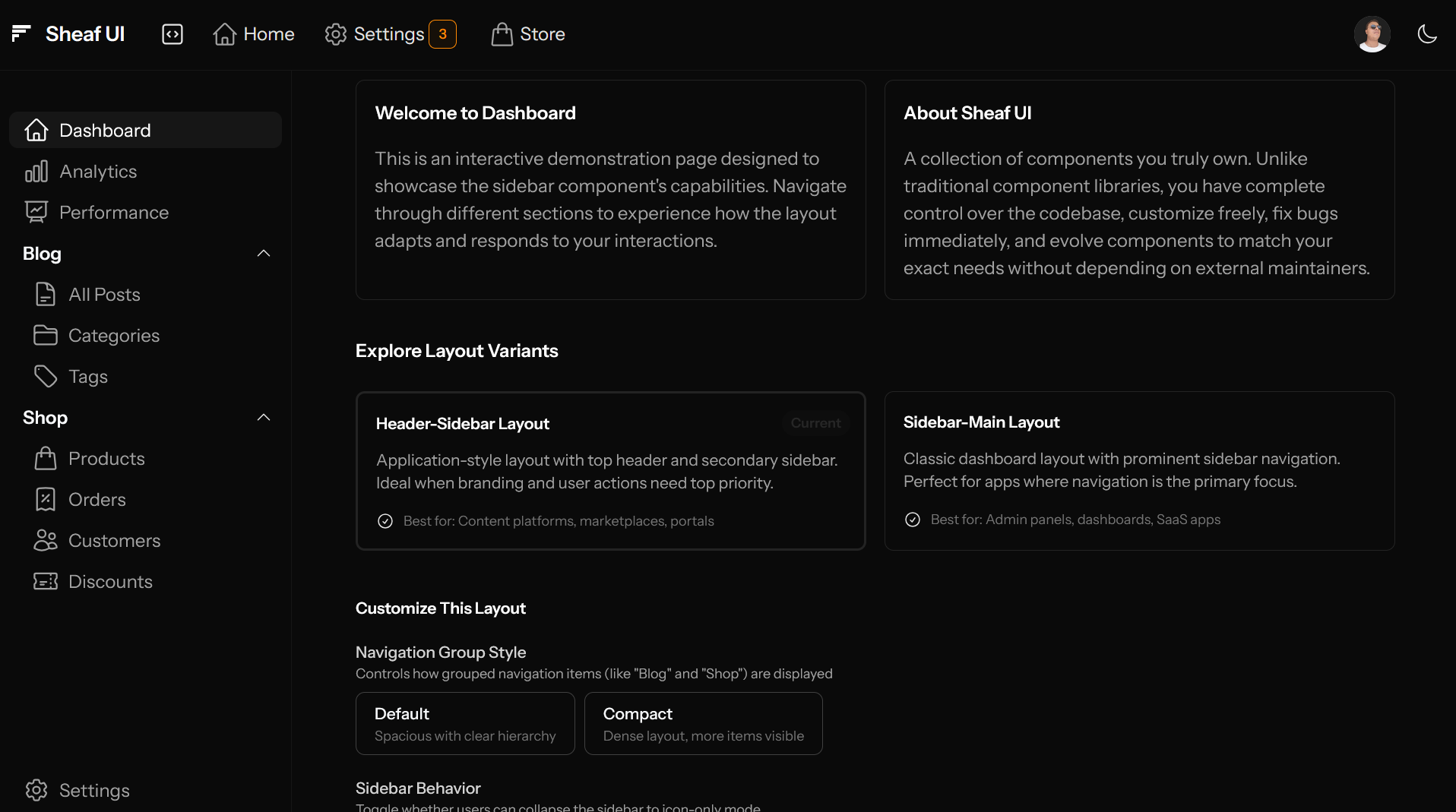
Header-Sidebar Layout
An application-style layout with a top header containing branding and primary actions, with a secondary sidebar for navigation. The header spans the full width above both the sidebar and main content.
Usage
<x-ui.layout variant="header-sidebar">
    <x-ui.layout.header>
        <x-slot:brand>
            <x-ui.brand name="Your App" href="/" />
        </x-slot:brand>

        <x-ui.navbar class="flex-1">
            <x-ui.navbar.item label="Home" icon="home" />
            <x-ui.navbar.item label="Products" icon="shopping-bag" />
        </x-ui.navbar>

        <!-- User menu, notifications, etc. -->
        <div class="ml-auto flex items-center gap-4">
            <x-ui.avatar src="/user.png" />
        </div>
    </x-ui.layout.header>

    <x-ui.sidebar>
        <x-ui.navlist>
            <x-ui.navlist.item label="Dashboard" icon="home" href="/" />
            <x-ui.navlist.group label="Content">
                <x-ui.navlist.item label="Posts" icon="document" />
                <x-ui.navlist.item label="Pages" icon="folder" />
            </x-ui.navlist.group>
        </x-ui.navlist>
    </x-ui.sidebar>

    <x-ui.layout.main>
        <!-- Your page content -->
        <div class="p-6">
            {{ $slot }}
        </div>
    </x-ui.layout.main>
</x-ui.layout>
Visual Example
Collapsable Prop
Controls whether users can collapse the sidebar to icon-only mode on desktop, by default are collaps&ble:
<!-- Fixed-width sidebar -->
<x-ui.layout :collapsable="false">
    <!-- ... -->
</x-ui.layout>
Note: This only affects desktop (≥1024px). Mobile and tablet behaviors are fixed.
Essential CSS Variables
The Layout component exposes several CSS variables that can be used by its child components:
| Variable | Default | Collapsed | Description |
|---|---|---|---|
--sidebar-width |
16rem (256px) |
4rem (64px) |
Sidebar width |
--header-height |
4rem (64px) |
Same | Header height |
To change these values, open the desired layout variant (for example, ui/layout/sidebar-main.blade.php).
At the top, you’ll find a $classes array similar to this:
$classes = [
    '[--sidebar-width:16rem]',
    'data-[collapsed]:[--sidebar-width:4rem]',

    '[--header-height:4rem]',
    // 'data-[collapsed]:[--header-height:4rem]',

    'grid',
    'h-screen overflow-hidden',
    'min-h-screen text-slate-950 dark:text-slate-50',
    // more classes...
];
Here you can tweak the variable values as needed:
[--sidebar-width:16rem]defines the sidebar width when not collapsed.'data-[collapsed]:[--sidebar-width:4rem]'overrides it when the sidebar is collapsed using a Tailwind data variant.
The same approach applies to the header height. By default, both collapsed and expanded states share the same height, but you can modify it if your design requires it.
Data Attributes API
The Layout component also sets several data attributes that can be used for styling or behavioral logic:
| Attribute | Values | When Present |
|---|---|---|
data-collapsed |
true / (absent) |
Sidebar is collapsed (desktop only) |
data-sidebar-open |
true / (absent) |
Sidebar overlay is open (mobile only) |
data-in-mobile |
true / (absent) |
Viewport is mobile (< 768px) |
data-in-tablet |
true / (absent) |
Viewport is tablet (768–1024px) |
Using data attributes provides a clean, semantic, and scalable way to style complex UI states. They also act as a bridge between TailwindCSS, Alpine.js, and Vanilla JS—especially when Alpine’s capabilities reach their limits.
Using Data Attributes in Styling
You can use these data attributes as custom Tailwind variants, similar to hover: or focus::
-
[:has([data-collapsed]_&)_&]:*– applies styles when the sidebar is collapsed Example:[:has([data-collapsed]_&)_&]:p-4 -
[:not(:has([data-collapsed]_&))_&]:*– applies styles when the sidebar is expanded
Or use them directly in CSS for more control:
/* Sidebar collapsed */
[data-slot="layout"][data-collapsed] .some-element {
    margin-left: 4rem;
}

/* Mobile view */
[data-slot="layout"][data-in-mobile] .desktop-only {
    display: none;
}

/* Sidebar open on mobile */
[data-slot="layout"][data-sidebar-open] {
    overflow: hidden; /* Prevent body scroll */
}
This hybrid approach gives you full flexibility: Tailwind for composable variants, and raw CSS for fine-grained or global rules.
Main Component
The <x-ui.layout.main> component wraps your page content and assigns it to the grid area:
Usage
<x-ui.layout.main>
    <!-- With header: no padding on wrapper -->
    <x-ui.layout.header>
        <!-- Header content -->
    </x-ui.layout.header>

    <!-- Your content with manual padding -->
    <div class="p-6">
        {{ $slot }}
    </div>
</x-ui.layout.main>
<x-ui.layout.main>
    <!-- Without header: automatic padding -->
    {{ $slot }}
</x-ui.layout.main>
Responsive Behavior
The Layout component automatically adapts across three breakpoints:
Mobile (< 768px)
Sidebar:
- Overlay mode (slides in from left)
- Hidden by default
- Toggle with hamburger button
- Backdrop overlay when open
State:
- Uses
sidebarOpen(boolean) - Not persisted (resets on page load)
Tablet (768px - 1024px)
Sidebar:
- Always collapsed (icon-only)
- Visible alongside main content
- Tap to toggle on touch devices
- Hover shows tooltips
State:
- Forced
collapsedSidebar: true - Prevents expanded state
Desktop (≥ 1024px)
Sidebar:
- Fully collapsable/expandable
- State persists via localStorage
- Smooth width transitions
- Keyboard shortcuts supported
State:
- Uses
collapsedSidebar(boolean) - Persisted in localStorage as
_x_collapsedSidebar
Touch-Friendly Interaction
On touch devices (tablets and phones), the sidebar includes enhanced touch targets:
- The entire sidebar area acts as a toggle on touch devices (desktop only)
- Brand area and toggle button are excluded from this behavior
- 48px minimum touch targets on all interactive elements
- Optimized for thumb-friendly interaction
Keyboard Shortcuts
| Key | Action |
|---|---|
ESC |
Close mobile sidebar overlay |
How It Works
The Layout component is actually a component dispatcher that:
- Selects the variant based on the
variantprop - Renders the appropriate layout (
sidebar-mainorheader-sidebar) - Includes the runtime script to prevent Alpine.js flicker
Component Structure
ui/layout/
├── index.blade.php          # Main dispatcher
├── main.blade.php           # Main content area wrapper
├── runtime.blade.php        # Pre-hydration script
└── variant/
    ├── sidebar-main.blade.php
    └── header-sidebar.blade.php
The Runtime Script
The layout includes a clever pre-hydration script that solves a common Alpine.js problem:
The Problem: When Alpine.js initializes, there's a brief moment where the component renders in the wrong state (expanded sidebar when it should be collapsed), causing a visible "flash" or "jump".
The Solution: The runtime script runs before Alpine initializes and:
- Reads the sidebar collapse state from localStorage (
_x_collapsedSidebar) - Detects the current viewport (mobile, tablet, desktop)
- Sets data attributes on the layout immediately
- Alpine then hydrates with the correct state already applied
Result: Zero flicker, perfect initial render ✨
Props
Main component
| Prop | Type | Default | Description |
|---|---|---|---|
| (none) | - | - | Accepts all standard HTML attributes |